Wiki Community/Discussion:Front Page
Front Page Survey Results / Project
A new initiative is starting to redesign the front page. The project is being led by Hal Goodtree from Cary.
Triangle Wiki Home Page Design
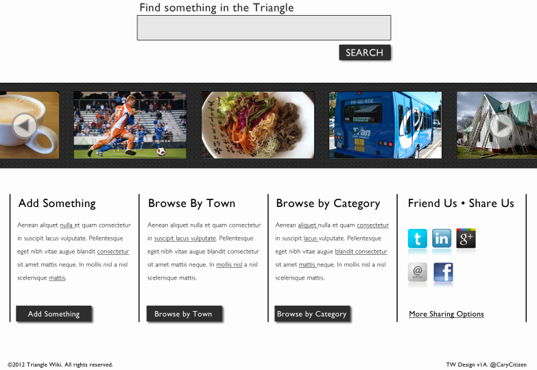
What follows is a preliminary design for the Triangle Wiki home page. We based our designs on answers to the Triangle Wiki Home Page Survey. The survey results are included in this presentation.
Please note that subsequent designs may utilize more color (for call-to-action buttons for example), but we’d like to leave that question aside for now until we get some feedback and can see other materials in development, particularly a new logo.
Finally, we’ve included a Responsive Design in this presentation. Responsive design detects (or sniffs) the display devices of users, serving content in the appropriate size. Our layouts for tablets and phones are a best guess at this point, but we should keep the notion of a responsive site in mind as the work progresses.
Thanks for the opportunity to throw down some thoughts about this important and exciting project.
Triangle Wiki Homepage Survey
The Triangle Wiki homepage Survey was designed to elicit answers to some top level, broad-stroke questions. 32 respondents participated. 100% of the repondents answered all the questions. Winning responses are in bold.
| Who do you think is the primary visitor to the Triangle Wiki home page? | ||
|---|---|---|
| People looking to contribute content |
|
25.0% |
| People looking to find information |
|
75.0% |
| Pick the word that best describes the "tone" of the Triangle Wiki home page. | ||
|---|---|---|
| Authoritative |
|
29.2% |
| Populist |
|
70.8% |
| From a design standpoint, what should predominate? | ||
|---|---|---|
| Text |
|
25.0% |
| Pictures |
|
75.0% |
| The home page should be: | ||
|---|---|---|
| Simple and clean ( a move-through page with a big search box) |
|
62.5% |
| Information rich ( a magazine style page like a newspaper) |
|
37.5% |
| Do you think Triangle Wiki should have a blog feature? | ||
|---|---|---|
| No |
|
62.5% |
| Yes |
|
37.5% |
| Should the home page have a slideshow? | ||
|---|---|---|
| Yes |
|
58.3% |
| No |
|
41.7% |
| Home page background should be: | ||
|---|---|---|
| White |
|
54.2% |
| Black | 0.0% | |
| Pastel Color |
|
12.5% |
| Bold Color |
|
8.3% |
| Picture |
|
20.8% |
| Abstract |
|
4.2% |
| Type of images you'd like to see on the home page: | ||
|---|---|---|
| Mostly people | 0.0% | |
| Mostly places and things |
|
33.3% |
| Combination of both |
|
66.7% |
| Designing a home page for Triangle Wiki is: | ||
|---|---|---|
| An event |
|
16.7% |
| A process |
|
83.3% |
Homepage Design version 1
Comments - Version 1
I'm a Web UI Designer / Usability specialist and the final design is quite clean. I would highly suggest adding a clarifying statement at the top of the page though about what the triangle wiki is in a short concise statement or tag line. Keep in mind there are other triangles all of the US (so we need to clarify NC) and I need to see a statement of exactly what the site is about (above the fold) so I can make an immediate decision if I am in the right place. -- Julie
-
I agree, we also need to put some weight behind the wording: "A website about the Triangle that anyone can edit" Look at the first sentence at http://daviswiki.org
-- Reid Serozi
Really nice job Hal Goodtree. Three points:
- I second Juliet Jarvis's points on clarifications.
- I think the image stripe looks great. Will it be a slideshow, revolving pictures? I think it is important that this shows that this is "a living page", not a stale site. Specific execution details will be important as this is the main visual component.
- a detail: Device specific adaptation is good, but it must feature a link to go back to the main site. It is annoying when a site shows a stripped down version on the iPad if the iPad is perfectly capable of handling the full version. See SeeClickFix for a negative example. Finally, the "Browse by Town" is a very promising approach as we grow; we should explore that also from other angles (site structure etc.)
-- Sandro
-
I agree about your statement of towns. I know this out of scope, but I see each town page create something that is more magazine style with ever-changing with lots of content, info, links, photos.
-- Reid Serozi
I like the clean lines and the incorporation of graphics. Is the graphic a carousel that will slide through pictures? That would be cool. :-)
Some additional thoughts/comment, below.
1) The Browse by category is too descriptive. Maybe "FIND something" would help get people to the next page. :-)
2) might be nice to re-order what is on the screen. Most people will come to FIND info, so I would put that far left...with ADD something to the right.
3) I'm a "visual" person, so an icon with the FIND, or ADD , or BROWSE would be nice. Like a magnifying glass? or PLUS sign? Just an idea.
4) I'd center the buttons in the sections.
5) I feel like there is something missing on the upper right side. Not sure what to put, but it seems naked. :-) Just my thoughts - but I really like the idea.
-- Lori
-
I think the "browse by category" is suppose to use the LocalWiki tagging feature? We would create a high level page with categories, maybe? Not sure...
I think the most important box is "by town", since many people want to see what's going on in their world, since the Triangle can be too broad
-- Reid Serozi
Several people have mentioned a carousel for the pictures. I had something like that in mind, just not sure what yet. The key factor is usability - we want the pictures to be clickable and draw people into content they may not have otherwise have noticed. Maybe a "random" button would be a good thing. In any event, the slideshow is the showcase piece on the page and we'll make the most of it.
- Hal Goodtree
-
Based on other comments and some further thoughts, I'd say the pictures needs the following features:
- Images need to change, either animated while viewing (http://www.cvillepedia.org/mediawiki/ uses Flickr for that) or static but different for each page load a click on the image will lead to the related page (cvillepedia doesn't do that)
- Image selection should be both randomized and at least partially curated for good pages (so a random selection from a curated list?)
- Rotation needs to work across platforms and not "weigh down" the page with load time or complexity.
- Needs to work with LocalWiki CSS, but ideally without relying on a external site/resource. What else is important?
--sandrogisler
-
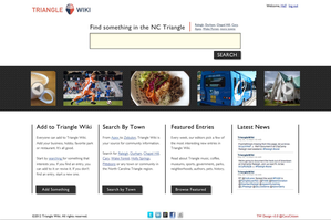
LocalWiki software adds the top navigation, page title "Front Page", search box, login, logo and wiki buttons across the top, so we need to factor that additional real estate into the design. I created a quick overlay with Hal's version 1 layout and LocalWiki's software portion. See image to the right.

-
The search button in the middle is also the function to create a new page in the wiki world. The idea is you search for content and have the option to create a new page if the page does not exists. I understand the majority of the survey results said the front page
 should be used to find (search) content, but I think we need to incorporate the wording "I want to make a page about" with a search box. It's want makes the triangle wiki unique.
 - Because the real estate above the fold is scarce, due to the thick LocalWiki header we should utilize the white empty space on both sides of the search box.
- Let's make sure the proposed site framework supports the desired content we want to display on the page... Looking at the framework of the four boxes under the slide show. The "browse by towns" is the most important one, since those will provide landing pages for each town. "Add something" could be used to target contributors with a helpful starter package. "Browse by Category" could use the tagging feature? Last, "Friend us" needs to be re-purposed for something else. The social media icons could run along the footer of the site. I think we need to figure out what content are we missing that should be presented above the fold. Maybe news about the triangle wiki project.
- Hal, not sure if you are asking for feedback on design yet or just framework/content? It's important the site does not appear/ feel commercial or overly polished, instead the site needs to appeal to many subcultures within the greater Triangle region. (feel: grassroots, indie, locally owned, hand-made market). Taking your framework and adding the elements found here, http://eighthourday.com/ , would give it that "grassroots" feel.
- Match the LocalWiki UI is important. Since we are not ready to take over the master LocalWiki CSS yet we need to make sure the design matches the out of the box UI. For example, the buttons, tags, title font.
Cheers, - Reid Serozi
Homepage Design version 2
Based upon feedback from our first design, we’ve completed version 2 of the Triangle Wiki home page.
This is still a somewhat preliminary design, but you’ll see we’ve moved some things around (social icons), added a bit of actual copy and repurposed the right-hand box for a Twitter stream. We’ve also added login/user info to the upper right.
I could use your help determining what should go in the third box below the slideshow. I’d imagined “Categories” but these don’t exist in the wiki format. Any suggestions about what to put in the space?
BTW – many people asked about the slideshow. Yes, I see it as a scrolling feature. Not sure how we’ll admin it yet – probably a subset of all the images with some type of admin control.
Homepage Design version 3 (final)
Includes Notes and a 960 Grid overlay.
source: http://carycitizen.com/pdf/tw-design-v3c.pdf
download psd https://www.dropbox.com/s/0kdiwuccubvr3h6/tw-design-3.psd


